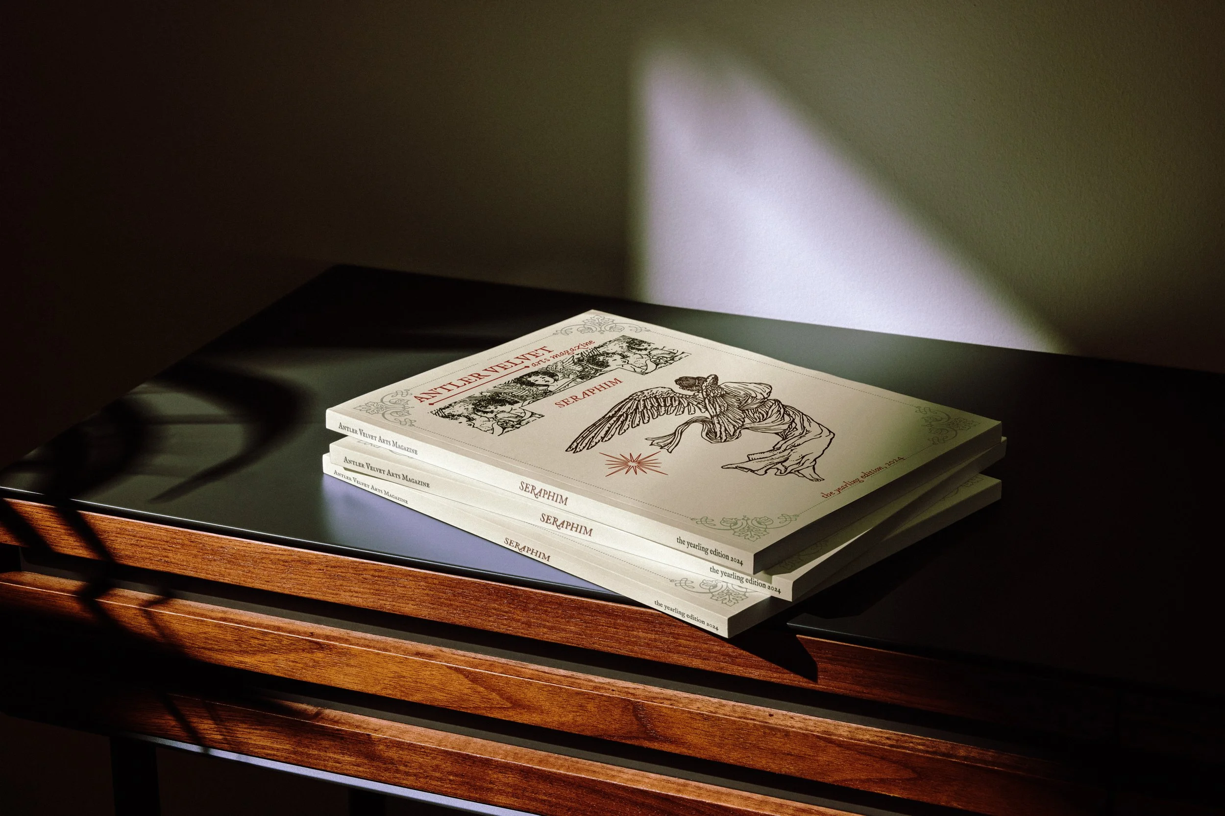
Antler Velvet Magazine.
Antler Velvet is an independent online arts magazine established by Dorian Winter, an artist and poet from Western Australia. The publication invites works of poetry, fiction, nonfiction, and visual art, fostering a diverse range of creativity without strict submission requirements. Antler Velvet's primary goal is to provide a platform for artistic expression, innovative concepts, and distinct perspectives. In preparation for the upcoming second edition of our online publication, Antler Velvet seeks a magazine layout that embodies a rustic and atmospheric aesthetic, capable of complementing various art forms for digital presentation.
Editorial Design, Layout Design
Using pre-determined brand identity and magazine covers from Editor-in-Chief and fellow artist Dorian Winter, I was tasked with creating a compelling, cohesive editorial layout that remained in line with the previously published issue, but also kept in mind the unique theme of "seraphim" for this edition. Seraphim are defined as 'celestial or heavenly beings'; we were interested in exploring how this theme can manifest across all art forms. I utilized one of the lightest beiges in the brand identity as the main background, accented by large, dynamic typography in various earthly tones, to create a visual contrast between the airy nature of heavenly beings and the earthly complexities of the human experience.
While carefully crafting every page, I prioritized the narrative behind each art piece. Purposefully placing written pieces with visual art that stirred a similar emotional response, I forged a connection between unique elements and perspectives to deepen the storytelling experience, seamlessly intertwining the theme of Seraphim throughout the publication.
Overall, my goal with this editorial design was to elevate the way in which these artists can share their perspectives with the world. It was essential to provide the art with room to breathe and be admired, all while enhancing the meaning and emotion behind each piece through intentional use of dynamic typography, thoughtful page sequencing, and contrasting brand colors.


